
 |
Every staged home runs the risk of looking plain vanilla ho-hum ordinary.
But with the clever injection of some texture and pattern, your DIY staging will hit the mark and win the hearts of buyers.Texture mixing is pretty simple. Just incorporate a variety of surface treatments and material -- shiny metals, rusted metals, nubby fabrics, silky fabrics, furry fabrics, smooth woods, distressed woods...You really can't overload textural interest unless you're overloading colors as well.
But pattern mixing is a little trickier. You can overload patterns.
Also, when you combine patterns for home staging, it's not the same as mixing patterns for personal decorating.
I'm here to help. Here are a few simple guidelines specifically geared to home staging.
Color counts
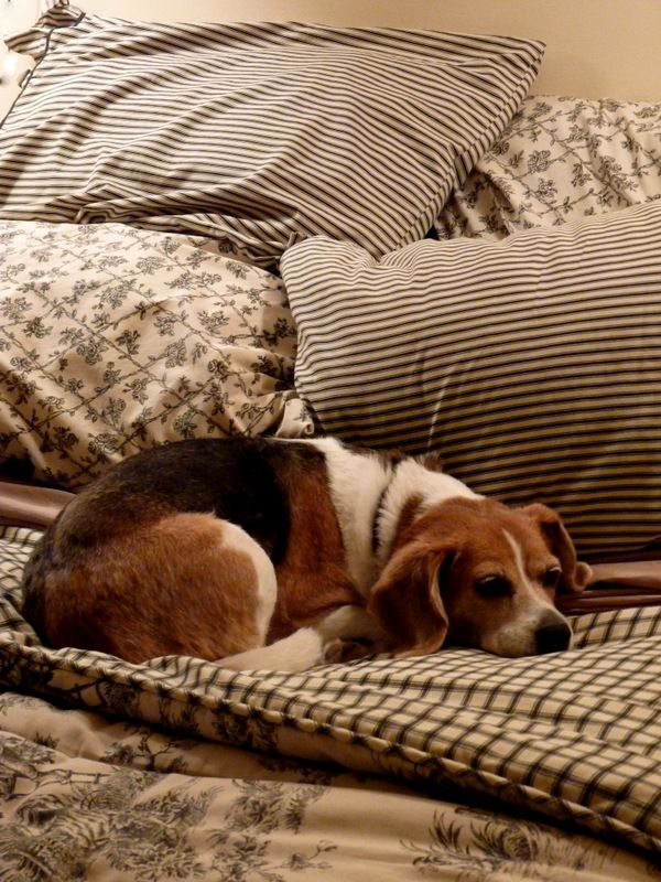 |
| A bed-in-a-bag and a beagle. She loves to make a nest in my co-ordinated Waverly fabrics purchased 10 years ago. |
Determine the undertones in whatever colors you use. Do they tend toward yellows or pinks or greens or greys? When in doubt, match your colors to a paint chip and ask at the paint store what the undertones are. They have the formula and know the pigments that make up the color, so they can identify the undertones for you. They'll do this even if you are not buying paint.
One goof-proof way to mix patterns is to buy fabrics bundled by a professional decorator. Bed-in-a-bag is an example. Retail outlets and manufacturers deliberately coordinate things like table linens, bath towels, and kitchen textiles to make it easy for you and to sell you more of their stuff. Buy their sets, or just imitate the online catalog and store displays.
Another way to be sure your patterns talk to each other and don't take over the room is to base your patterns on a single color. For example, I'm picturing a room with creamy draperies edged in pale yellow, yellow floral and chevron striped pillows, and a yellow gingham upholstered chair.
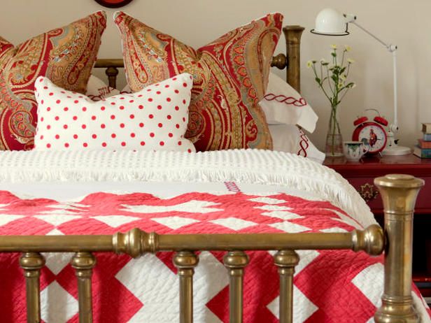 |
| Repetition holds this assortment of fabric patterns together. We see a rich red and a faded red. The chain motif trimming the pillows repeats the curves of the paisley pillows. The polka dot pillow imitates the tufted chenille bedspread.And the gold in the pillows repeats the gold of the brass bed. Photo: BHG |
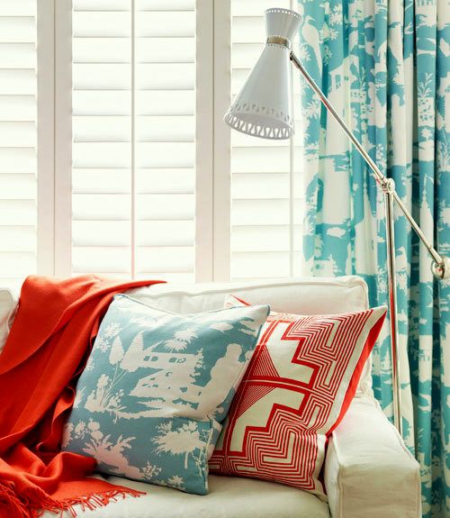 |
| A charming, contemporary toile in teal and a mandala-like design in orange complement each other beautifully. These draperies don't strike me as too matchy at all! Photo: Woman's Day |
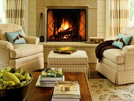 |
| You can't go wrong with the classic combo of floral (carpeting), plaid or check (chairs), and a stripe (draperies). Photo: Myhomeideas.com, by Erica Georges Dines |
Scale is all about size, style, and placement
Mix large patterns with small patterns and something in between. This kind of mixing creates a finished, stylish, and interesting look. Mix angular geometrics with curvy florals. Mix ombre, ikat, ethnic, and batik prints and with crisp modern designs. These kinds of juxtapositions delight the eye and bring a room to life.Spread your patterned pieces around the room, as well. If all your patterns are on pillows clustered on one couch and the rest of the room is showing solid colors, there's an imbalance. Pattern placement keeps the eye moving, and that's what you want.
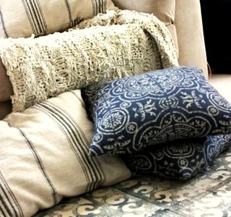 |
| A lovely collection of subdued blues. The bedspread is a block print using a rubber welcome mat. Photo: Leah Moss |
Restraint rules the day
Limit your pattern selections and color choices to three. Sounds boring? Sure. Looks boring? Not necessarily! An uncluttered home looks new and clean.Remember that you can repeat the patterns in more than one place. A striped panel in the draperies can be repeated on a table runner. That's not matchy-matchy. That's just cross-pollination.
One strategy to make a room look more intentionally designed than thrown together is to use similar or identical trims on upholstered pieces, window treatments, lampshades, pillows, and other accessories. Your trim could be something like white cording, a fuzzy fringe, a colorful rick rack, gold braiding, or patterned ribbon.
Tone down the size of bold contrast patterns. This one trick will help keep your rooms looking comfortable and tasteful. If you're staging a really large room, you'll need some large textile designs, but they can be composed of subtle color variations.
So, don't be afraid of printed textiles. They can help you sell your house! There's plenty of solid color in most rooms to balance a selection of prints and patterns. Just jump in, and follow my guidelines for mixing and matching prints for home staging.
If you want more tips to stage your own home, be sure to order my eBook, DIY Home Staging Tips to Sell Your Home Fast and For Top Dollar. It will teach you to stage like a pro!
