
 |
You know a decorating craze has reached its zenith when you can buy it by the bagful at the dollar store.
I'm all for beautiful calligraphy. I appreciate the finer points of typography.
Many years ago, as a young magazine editor, part of my job was "spec-ing type." That means I had to mark up typed manuscripts so the printer would know what style and size type to set them.
It wasn't nearly as much fun as all we can do on our computers now.
Today signage is everywhere in homes, proclaiming the love we have for our families, the strength of our faith, the quotes we find uplifting or amusing.
Witness the avalanche of "Keep Calm and ..." signs. Enough already! It's clear that signs and any art with typography or handwriting are appealing. When used for home staging art, it can add drama and some quirkiness, but there are limits to its practicality.
Let's look at the plus side of the ledger first. Here are some of the benefits of using signs for décor:
- They can set a mood with a message.
- They can be inexpensive.
- They are easy to hack (except for the fine art of real, hand penned calligraphy).
- They can add a touch of lightheartedness.
- Foreign languages look sophisticated when used as art.
- Handwriting can look funky-fun-decorative.
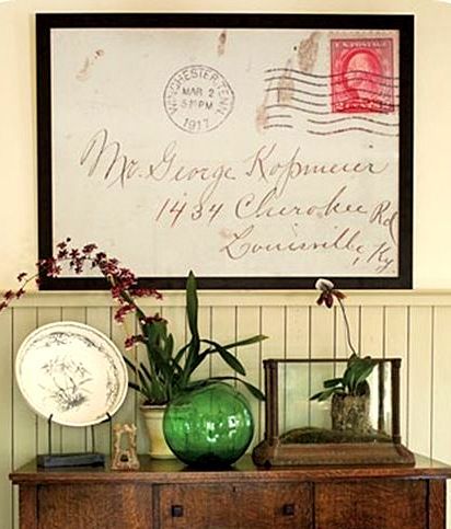 |
| I loved this image the moment I saw it on Centsational Girl's blog. It feels so personal, nostalgic, and graphic in all its overblown glory. |
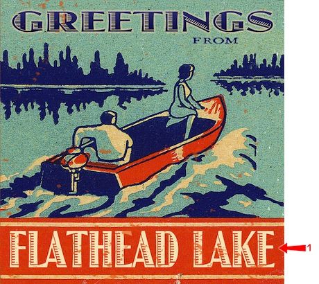 |
You can't go wrong with a vintage travel poster. This one is from Lakehouse Outfitters.
|
The pitfalls of using lettered art
There is something compelling about the written word. People stop and read words. For this reason, I never encourage people to load up with anything that people want to stop and read.
If you feel compelled to announce your philosophy of life to the world, may I suggest that you write it in Spanish, French or Chinese or another language that speaks to you. "Carpe Diem" looks so much more sophisticated than "Seize the Day." And how about, "Dérouler le tapis rouge," for "Roll out the red carpet."
Keep it short.
Get your message across to your potential buyer by decorating in a style anyone could love, and leave the lettering for your next home when this one sells.
Top photo: Apartment Therapy