The All-White Color Palette -- Is It Alright for Staging?

Monday, August 27, 2012

Color is a powerful tool. You can use it to draw people in, relax them, excite them, or -- heaven forbid -- send them packing.

What color scheme will you use to stage your home?

I've blogged about choosing a paint color and I've blogged about different colors like periwinkle and cyan, and about specific color schemes like black and white, and blue and white. But we haven't chatted about the all-white palette.

Does the idea of decorating your home in whites sound crazy impractical or totally boring? Let's look at whether the color white could be the smart choice or the dumb choice for your home.

White's not really a color. It's actually the absence of pigment. Nevertheless, most white paints and white fabrics have some color cast. There are warm whites like cream, ivory, and sandy whites. And there are the cool whites that are very slightly tinted with mauves and blues. The color experts recommend staying in one family -- either the whites with cool undertones, or the whites with warm undertones.

My favorite color consultant Maria Killam goes even further and distinguishes between beige undertones and yellow undertones and pink undertones. If you read her blog, you know that when you get it right, the room looks perfect!

Styles that call for white decor

Certain architectural styles and certain locales traditionally depend on white furnishings and paint for their uniqueness.

How chic would urban chic be without stark white walls?

How charming would coastal cottages be without whitewashed floors and white fluffy pillows?

How classic would country homes be without those white picket fences? And what shabby chic room is complete without its chippy white furniture?

If your home falls into any of these categories, you'll want to make white an important part of your decorating. Still sound boring? A professionally decorated room is never all white-white. You'll see different hues of white and different textures to keep things lively.

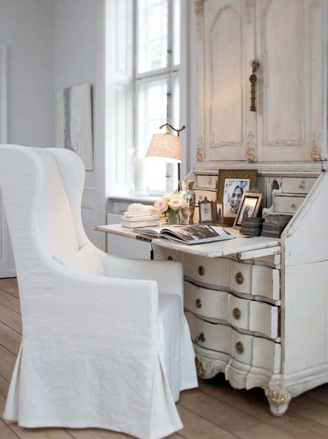
There's no shortage of textures in this mostly white room by Roughan Interior Design.
A faux fur throw contrasts with the sleek white seating, glass shelves, and silver drum shades.
 

What's great about white?

WHITE'S HANDY. The decorators who love white love it because it's a blank slate, a marvelous foundation for what's to come -- all the fascinating furnishings they can pile on, knowing that white is The Great Unifier. You can use white this way when you are staging your home. If your furniture is a collection of thrift store bargains and hand-me-downs, painting them white is one simple way to make them match.

WHITE'S TIMELY. White is never dated. White will never go out of style. White will work with all other colors. Simplifies things, doesn't it?

WHITE'S BRIGHT. All white paints (and many pastels) have a high light reflectance value (LRV), which means simply that they reflect more light than darker paints, and that translates into rooms that look larger and brighter. When you put your home on the market, you can paint your rooms that are too dark or too small with a bright white paint and they will appear lighter and larger.

However, if your home has interesting architectural features, use a gray-white paint to finish your walls and trim because gray-white paints (like Sherwin Williams Lattice or Moderne White, and Benjamin Moore's Paper White) cast shadows to emphasize the details built into a room. Grays eat up light instead of bouncing it back. Bounced light makes details disappear.

WHITE'S CLEAN. White works well for home sellers also because it reads as a clean color. White is reassuring to people touring your home. White builds trust the way a doctor or pharmacist's jacket does. Bakeries and ice cream parlors, seafood stores and butcher shops typically have white walls. It's the hygiene thing.

WHITE'S BENIGN. White's also a good home staging color because buyers can't be offended by it. They probably won't say, "Too bad they painted the walls white.We'll have to paint them over before we can move in." More than likely they will say, "Our furniture will work with the wall color.We won't have to paint right away."

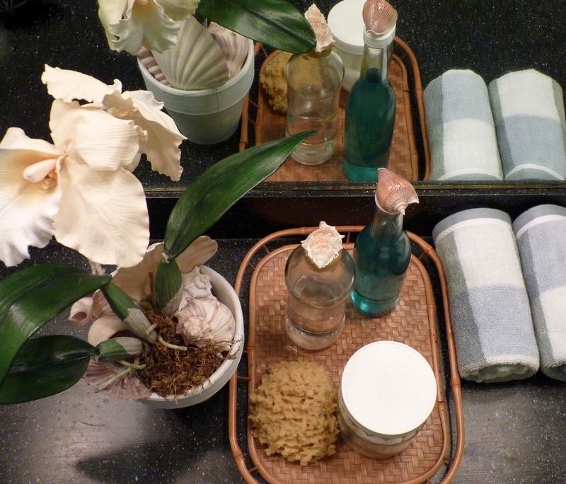
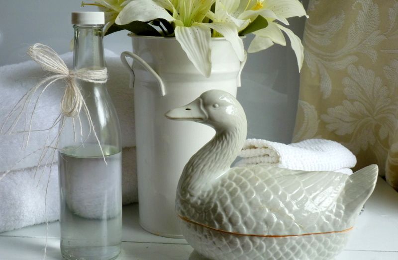
Buyers expect an almost sanitized look in bathrooms, so staging a bath with white
towels and toiletries is a natural. Go for a variety of textures and off-whites. 

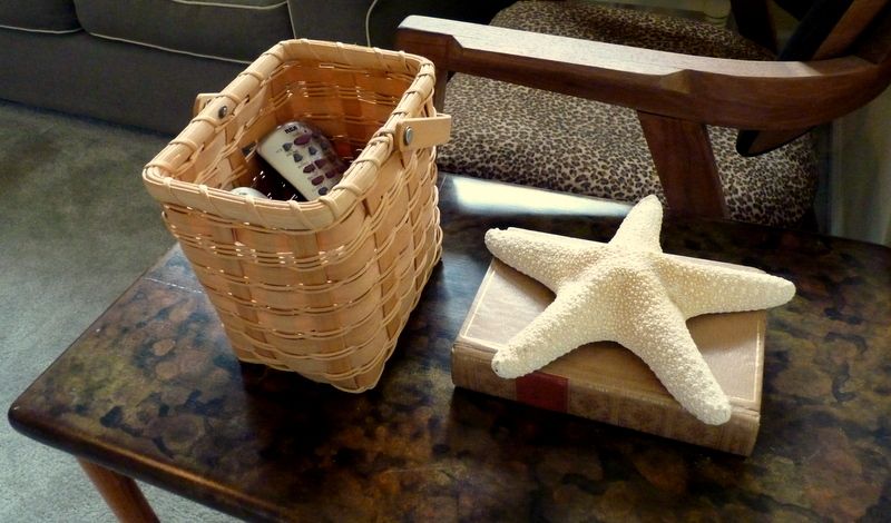
White decorating accessories are easy to find, both in stores and in nature. 
If you don't have an assortment of white props, paint can change that. Kristen Hutchins Design.

What's the bad news?

IS IT DIFFICULT TO MAINTAIN? The most common argument I hear against using white for decorating is... well, kids, husbands, and dogs. Although I have lived with white walls, white carpeting, white tile flooring, white bed covers, and white painted furniture, I have never lived with white slipcovers. But my friend Kristi has, and she swears that washable white slipcovers are easier to maintain than anyone imagines.

If you think white shows the dirt, compare it to dark colors. Have you ever worn your little black dress to a dinner party where the hostess owned white, long-haired dogs? Or tried to maintain a spotless look on dark wood floors?

Unlike dark or brightly colored furniture, white painted furniture seems to eat dust. It's very forgiving. Trust me on this.

IS IT TOO STERILE? The other argument I hear about white decor is that white rooms look antiseptic. That's a possibility, but there are easy solutions to the problem. Soft textures, rustic touches, furnishings with patina, distressed furniture finishes, green plants, or spots of color -- any of these additions will minimize or eliminate the sterility of an all-white room.

This kitchen's white has a cool cast. The stainless appliances, the metal countertop, 
and the black shelves are a perfect fit for cool whites. Photo: Aidan Gray Home.


As you can probably detect, I'm partial to whites in staged homes. I don't suggest installing pure white wall-to-wall carpeting in order to market your home better, but I can see the value of injecting more white into a decorating plan, and possibly staging one bedroom as a white-on-white. show-stopper retreat. Yummy! 

There are times when an all-white color scheme just isn't right. A historic home like a Craftsman or a Victorian begs for colors appropriate to the style. A cookie-cutter condo or a new starter home might look more interesting with some distinctive color on the walls. You be the judge. But don't be afraid of white! 

Get the look, get the book

Staging a home around a white palette is very effective. And it's easy. You can find more easy tips and tutorials in my eBook, DIY Home StagingTips to Sell Your Home Fast and For Top Dollar. Download it now and start your staging today.   

Top Photo: Slettvoll via DecorPad.

Five Tricks Professional Stagers Use

Monday, August 20, 2012
 

Selling your home can be stressful.

It's one of the big transitions in life, and there are so many details to take care of. 

But staging your own home needn't be something to stress and obsess about. 

To help you get up to speed with staging, I've collected some of the best sure-fire secrets of the homestaging trade.

My favorite way to learn a new skill, whether it's knitting, or Qi Gong, or batik printing (something I am working on for an upcoming project), is to look at what the experts do, then follow their lead.

No one learns in a vacuum.

Why learn staging by making mistakes or looking at examples of what doesn't work? You have just one chance to make a first impression on buyers.

So, here are my favorite professional shortcuts to success that will be easy for you to follow. Ready, set, go! 

1. Paint all your walls one friendly color

Stagers call friendly colors the ones that most people like. Most people feel comfortable around warm whites and pale neutrals. Avoiding strong colors lets people touring your home relax and get a sense of the room, without the distraction of saturated or unusual colors.

It also lets them know they can probably move in without having to paint the walls.

Unwise wall colors to use when staging? Purples, deep red, Pepto Bismol pinks, black, chocolate, or dark greens. I've already written about my own method for choosing a paint color.

Why one color? Because one color will unify your house, so that rooms "talk to each other." It will also make the house feel newer and larger. And it will save you money on paint, and save you time when you have to touch up. One color. Everywhere.

If one color just doesn't work with existing fixtures (maybe you have a fireplace with yellow undertones  in the living room, and countertops with pink undertones in the bathroom) chances are you can find two colors that still "talk to each other." 

Forget the bad rap neutrals get for being boring. You want benign colors that offend no one. 
You want colors that will unify all your furnishings. You want colors that anyone can live with,
at least temporarily. No one would call this entranceway boring. Photo: BHG

2. Start with some matched furniture sets

I know, I know. Matchy-matchy is passe. All the decorators, the shelter mags and bloggers are raving about mismatched and eclectic furnishings. 

But, darn it, there are times when a couple of perfectly matched pieces of upholstered furniture in a living room that’s otherwise a jumble of assorted furniture styles, just pulls everything together and elevates the perceived value of the room.

If you don’t own matched furniture, often slipcovering, reupholstering or painting some existing pieces works the same magic. Adding sets of lamps, vases, or framed art also works. 

It's not just the upholstered chairs that match in this living room. The tables and pillows are 
pairs as well. A matched set of prints on the wall reinforces the idea of a cohesive, 
planned design, rather than just a collection of furniture in one room. Photo: BHG  

3. Mix in some stuff that shines

Every room needs a shot of shine. Mirrors and glass fill the bill. These reflective surfaces bring to any staged room more light, more space, and more upscale glamour. Since mirrors bounce back whatever is before them, they create the illusion of larger, more open areas. Make sure they're reflecting something pretty!

Glass topped tables show more of the floor, so a room appears bigger.

Do a walk-through and check your home for furnishings that add some gloss, some glimmer. It could be mirrored picture frames, mercury glass on the mantel, a glitzy chandelier, or a Lucite table.

A grouping of small mirrors in wooden frames was all it took to add some sparkle to this 
dining area. The mirrors act like windows to create the sense of openness. Photo: BHG  

4. Make those windows look tall and wide

Although the simplest way to hang curtains and draperies is to place a tension rod inside a window casing, that’s not always the most flattering treatment.

Professional stagers know the bigger the windows, the more interesting and generous a home feels. So, mount your hardware high on the wall and away from the sides of the window. Screwing hardware to the window trim makes holes that are difficult to fix with putty and paint. Holes in the wall are way easier to repair. 

Exceptions to the rule? Historic homes where you want to show off architectural details around a window. Or ultra-modern spaces where you want the minimalist look of unadorned glass. Or a small room with a small window where small is part of the charm and large window treatments would dwarf the space.  

Big, beautiful windows become the room's focal point when dressed like this -- 
with plenty of fabric surrounding them. Imagine this room with skimpier draperies,
and you'll see how important window treatments are. Photo: BHG  

5. Freshen up with greenery and blooms

Real ones or silk ones, the debate goes on. But one thing’s for certain: plants add a certain je-ne-sais-quoi. Ya just gotta have ‘em!

I lean towards silk plants as long as they are good quality and not cheap cemetery-style blossoms.  Other stagers swear by orchids. I don’t like clients to have to care for plants. There are ways to make silk plants look like real plants.

And I think that, except for Open House Day, cut flowers just don’t make any sense in a staged home. They require too much attention and don’t last long enough for me. If you have an unlimited floral budget or an abundant cutting garden of your own, maybe it’s possible. Otherwise, silks to the rescue!

There's always room for some greenery or flowers. At least, there should be! 
Silk plants and flowers are easy to care for, look terrific, don't offend the scent-sensitive,
and you can take them with you when you move. Photo here and at top: BHG 

Get the look, get the book

Once you’ve decluttered and cleaned, take some time to run down this list of five steps the pros know. These are the methods decorators and stagers use daily to get homes sold!

You don’t have to reinvent the wheel to stage your home. Tricks like these and my eBook, DIY Home Staging Tips to Sell Your Home Fast For Top Dollar, will make it easy to stage a home that buyers want.


Cheap Chic: DIY Framed Art for the Clueless Crafter

Monday, August 13, 2012
These custom framed botanical prints
look classy, but are
economical and easy to make. 
My friend Judi had me laughing yesterday. 

She told me that if she enters a Michaels store, the security alarms go off because she doesn’t have a crafty bone in her body.

Do you feel that way when you see craft projects on blogs and in magazines? 

Would you like to produce some simple but professional-looking art for your home on the market?

Maybe you’ve decluttered and cleaned your home and then discovered you’ve stripped away too much personality! 

Or maybe you've removed all your family photos and now have bare walls staring back at you. 

Well, that’s the time to summon framed artwork to the rescue. Follow this tutorial, and you'll have some artistic finishing touches for your staged rooms.

Art's value 

Nothing adds character and charm to a room like artwork on the walls. Here’s my step-by-step for making a set of pressed botanicals framed with custom mats.

The key to making any art look impressive is in the matting and framing. 

Even a child’s squiggle or a vintage postcard looks smashing when it has some space (the mat) and a border (the frame) around it. So, there’s no need to dig deep into your budget to decorate even large walls in your home with original art. Artsy, frame-worthy stuff is all around!  

In this tutorial, I’ve used dollar store frames that came with cardboard mats, and recovered the mats with scrap fabric to complement the two kinds of ferns I picked.

What You Need

  • Some specimens of greenery or flowers
  • Paper towels and large books for pressing the greenery
  • Something heavy to weight the books while pressing
  • Lint-free glass-cleaning cloth
  • Frame with mat and glass
  • Sheet of plain paper, larger than mat opening, preferably a stiff paper like watercolor or pastel paper, but budget construction paper will work as well  
  • Scissors, sharp ones
  • Screwdriver, flathead
  • Fabric, larger than mat, and in a color or design that coordinates with the room where the art will hang, and that compliments the artwork itself 
  • Tape, either transparent or masking
  • Rubber cement
I chose some green fabric and some brown fabric that picked up the colors of the two
ferns I planned to frame in two separate frames. You could use a pattered fabric as well.

Place your greenery between layers of paper towels. Choose perfect leaves or flowers,
free from blemishes or holes. Thinner leaves without much moisture content work best. 
Set the paper towels and leaves between books that are large enough to cover the
area of the leaves, and weight the stack with a gallon of something. Depending on how
thick the leaves are and how much moisture they have, pressing them to make
them dry and flat can take from 1 week to a month.
Wish I could be more precise, but there are too many variables. 
Once your leaves are dry and flat, you're ready to assemble your art.
Use your screwdriver to remove the backing and mat from your frame.
Clean the glass on both sides to be sure it is spotless and streak-free.
If using a recycled frame and glass, remove the glass to clean it well.


Lay the mat face down on the fabric, and rough cut about an inch outside the mat. 

Place a piece of tape in the center of each side to hold the fabric.
Alternatively, you can use spray adhesive to hold everything in place. 
Then, rotating the mat to keep the fabric squared and wrinkle-free, 
tape each side, working from the center to the corner on each side. 

Use scissors to cut an X in the center of the fabric. Cut almost to each corner. 

Remove the excess fabric from the center.

Clip excess fabric from each corner.

Tape fabric at each corner. The outside corner needn't be perfect, 
because the frame will cover the outside edge of the mat.

 Carefully cut the fabric into the corner, and tape it flat. 
Make this inside corner as neat and square as possible. 

Lay the glass and then the fabric-wrapped mat in the frame. 
Double-check to be sure you have not captured 
any lint or other junk under the glass. 

Place your pressed leaf or flower on the plain paper
that will be the background of your art. 
When you are sure of the placement, use just a few dots 
of rubber cement to affix it to the paper. Place the 
rubber cement where it won't show, like on the stem. 

Place the paper face down on the back of the mat and 
use a piece of tape in each corner and in the center of each side to 
adhere it to the mat. Turn it over, and double-check that it looks 
the way you want. Then, replace the backing on the frame. 

Finally, hang your framed artwork. I chose to use the green mat for the brown fern 
and the brown mat for the green fern, to make them play off each other.


I think sets of "prints" like this will dress up any area with style. 
If you want to make larger art, you can combine more than 
one leaf or flower to fill a larger frame. 


Cheap tricks and why they work

What makes this art special is that the mat is custom, so your art looks more important than something you took off the store shelf, or something you printed from an online source and stuck in an ordinary frame to stage your home. Custom mats are one way you can get away with using cheap frames like these that I used for a previous project.

Please note that these pressed specimens are not of archival quality. They may turn brown with time because I did not dry them in silica gel or press them for a year under encyclopedia books, but they will look just fine until your home sells!

Some other possibilities for frugal framing are butterflies, coins, fabric scraps, children's art, photographs, or antique advertising. Choose the content and style of art that flatter your home and that emphasize what makes it unique in buyers' minds. 

My eBook, DIY Home Staging Tips to Sell Your Home Fast and for Top Dollars, can give you more ways to add color and interest to your walls. Download now and you can begin creating art that even my friend Judi could manage and be proud of.

A Photo Primer for Staging Your Tabletops

Monday, August 06, 2012

Let's talk about the tables in your home on the market. 

Whether it's a sofa table, coffee table, nightstand, end table, vanity top, or even a mantel, a flat surface is an opportunity to deliver that crucial "Buy this house!" message to people touring your home.

Each tabletop should tell a story. The story, in essence, is how lovely it would be to live in this home. 
I've selected photos that demonstrate the best tabletop staging tips I know. 

When it's time to create a tablescape, shop your own home, including closets, garage, attic, outdoors and even the recycle bin for interesting stuff to use or upcycle. Look for items that have interesting shapes and textures. Your props should be handsome and pretty without being overly detailed or distracting. 

Most of us decorate our coffee tables and other surfaces at holiday time, but how about when your home is for sale? Use your skills and imagination as a DIY stager to make these surfaces speak to buyers. 


Every table vignette needs a natural-looking element, 
like this silk orchid. Other choices would be shells, wood, baskets, 
rocks, or fruit. These items don't need to
be real, but they need to look like they came from nature.

Vary the heights of your elements. Usually the tallest 
or heaviest object
is the focal point of your arrangement.
Whenever there is something special about your home,
emphasize it. Table decor is an easy way to showcase specialness,
like a water view or historic location. Note:
Many people will look at book spines and
covers to judge owners and their tastes.  
Some tables you will want to fill with lots of books, plants,
baskets and bowls for a luxurious display,
and in other places a sparse setting like this one is all you need.
It depends on your 
home's style. Avoid displaying
collections of things that might be too distracting.  
A bathroom vanity is easy to stage. Use something shiny,
something natural, and something soft. 
Keep the color scheme simple, trendy, and refreshing.
Buyers want a bathroom that feels, looks and smells clean! 

A tray of any kind will unify a bunch of items.
This silver tray provides a grounding
for a milk glass vase, some white books, and the shabby basket.
Remember not to stage with small valuables that could be stolen.

Got nitty-gritty? Hide the unsexy things like remote controls
and grooming essentials in attractive baskets or boxes. 
They'll be handy but less obvious. 

An unstaged tabletop is a missed opportunity to impress a potential buyer. I hope you'll have fun clearing off and reinventing the flat surfaces in your home when you stage it to sell!


I give you other ways to deliver the right messages to buyers in my homestaging eBooks, DIY Home Staging Tips to Sell Your Home Fast and for Top Dollar, and How to Arrange Furniture, and No-Sew Curtains and Draperies to Stage Your Home. Each eBook stretches your home staging budget from here, all the way to a purchase offer!

Say Hello to My Read of the Week

Wednesday, August 01, 2012
Ordinarily I don’t like being called a stickler, a vigilante, or an obsessive. But when the accusation puts me in the company of Ms Lynne Truss, I consider it a compliment.

Also ordinarily, I do not write book reviews, but Centsational Girl is hosting a linky asking for book recommendations, so I am adding this post to the party.

Lynne Truss is the British author of a book with the improbable title of Eats, Shoots & Leaves. If it sounds familiar, that’s because the book’s been around since 2002. She's a self-professed stickler for proper punctuation, who obsesses over misplaced commas, and toys with the idea of forming a party of vigilantes to remove superfluous apostrophes from green grocers' signs and movie marquees.    

Who would have guessed then -- or even now -- that a book whose subject is punctuation and the abuses it suffers in contemporary England would be so entertaining? Not most of us, and not the author either. But it’s become a best seller with over three million copies in print.

Does a book that reviews the when and where of placing dashes, hyphens, colons, apostrophes and semicolons, sound boring? 

Trust me, it’s not. I hung on every word and re-read some sentences for the sheer pleasure of savoring the style and content. Call me crazy, but first listen to Ms Truss talking about the exclamation mark.  

Ever since it came along, grammarians have warned us to be wary of the exclamation mark, mainly because even when we try to muffle it with brackets (!), it still shouts, flashes like neon, and jumps up and down. In the family of punctuation, where the full stop (what we call the period in this country) is daddy and the comma is mummy, and the semicolon quietly practices the piano with crossed hands, the exclamation mark is the big attention-deficit brother who gets over-excited and breaks things and laughs too loudly.

Or what she has to say about the two ways a Biblical quote is punctuated:

Now, huge doctrinal differences hang on the placing of this comma. The first version, which is how Protestants interpret the passage (Luke xxiii, 43) lightly skips over the whole business of Purgatory and takes the crucified thief straight to heaven with Our Lord. The second promises Paradise at some later date (to be confirmed, as it were) and leaves Purgatory nicely in the picture for the Catholics, who believe in it.

In this sample, she provides proof of the power that punctuation holds, and how it can change the meaning of a simple sentence:

A woman, without her man, is nothing.
A woman: without her, man is nothing.

While Ms Truss is a stickler for punctuation, she is not a strict grammar snob. She’s not averse to breaking the rules of good writing for the sake of clarity. So, relax. She’s not going to hound you about using the Queen’s English, or sticking to obsolete restrictions from the last century.  

Although I learned some new rules and tips about how punctuating properly can enhance the clarity and rhythm of my writing, there’s not much I can do about my envy of Ms Truss’s writing talent. There is no way I could train myself to write with such acerbic wit, such frisky spirit, such off-the-wall vocabulary.

The Wrap: Eats, Shoots & Leaves is a brisk read, casual, personal, funny, and spiced with just enough historical trivia and literary quotes to make it meaty. 

If you are a writer (and if you blog, you are) and you haven’t put your hands on Eats, Shoots & Leaves yet, please add it to your must-read list. My local library had two copies of it -– always a good sign that it’s a book worth reading. 

Even if it doesn’t change the way you punctuate, you’ll have spent a few hours (it’s only 200 cute pages) in the company of a delightful individual.

Popular Posts